by Paul Turley
 , Mentor, SolidQ

from SQLServerBiBlog.com

What I’m going to show you is not rocket science. This one gets filed under the category of “well, duh. That was easy …now that I see how to do it.”
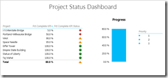
Power View sets the maximum value for a chart series based on the maximum unfiltered axis value; pretty simple but not too flexible. Let’s say that I want to show the progress of project completion. If I add a percentage type measure to the Value of a column chart with no fields on the Axis, it will plot a single column “gauge” chart with the maximum value (in this case 65%) somewhere near the top of the chart. I suppose that’s what we asked it to do but there is no way to manually set the maximum range of the axis scale. Oh, what to do?
Like most beyond-the-basics capabilities in Power View, the answer is to enhance the semantic model – and this one’s easy. In the PowerPivot or SSAS model, create another measure. I’ll do it right next to the existing Percentage calculation named “Project Pct Complete”. The objective is to get the gauge visual (our no axis column chart) scale to add up to 100% so what we need is another measure that when added to the first one, adds up to 100%. I’ll call that calculation “Remainder Pct Complete” using the DAX expression:
Remainder Pct Complete:=1 – [Project Pct Complete]
By subtracting the % Complete from the number one, the result will always be the remainder of 100%. I’ll format the new measure as a percentage.
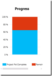
Now I add both measures to the chart/gauge like so:
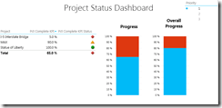
I haven’t quite got the legend to work the way I want it to. In this case, I’d probably just hide it and then maybe show data labels for the two series values. That’s all up to you, of course. For extra credit, let’s add another progress gauge that shows the overall progress even when a slicer is used to filter the data. First of all, test this. I’ve added a Priority slicer and selecting one or a combination of items slices the project rows and changes the progress gauge value.
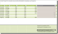
Back in the model, I add two more measures starting with the existing expressions. You can just copy one of the measure cells and paste it into an empty cell. This must be done on-at-a-time. The expression is enhanced using the CALCULATE and ALL functions, like this:
Overall Project Pct Complete:=CALCULATE([Project Pct Complete], ALL(‘Projects’))
This says “Apply the Project Pct Complete measure calculation to whatever filter context is provided in the CALCULATE function. In this case, we are says “ignore the natural row or filtering context of the query and always apply the calculation to all rows in the Projects table.”
Now, when a slicer or filter is used on the report, the Overall gauge continues to show the same percentage while the rest of the report, including the Progress gauge shows only filtered values.


