Table of Contents
The ribbon interface will be an awesome step forward for the future of Microsoft's software product usability.
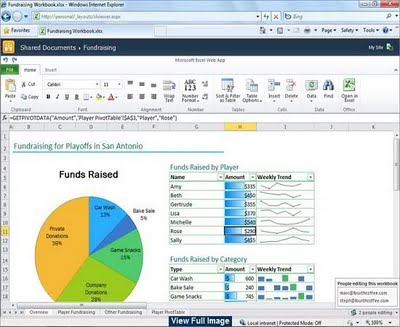
The way I look at it, ribbon buttons give the same look and feel across all the recent products released by Microsoft. The products are SharePoint,
MS Office, Dynamics CRM 2011, Microsoft Office 365, etc. to name few. So the users and developers who are using these Microsoft products feel connected when they move from one application to another. They feel a sense of Deja Vu, if I must say.
The best thing is Microsoft has already started putting all its business software online and in the cloud. Take Office 365, Dynamics CRM 2011 online, Office Documents, etc. All these online versions have one thing in common. A friendly and common way to access the menu functionality in the form of Ribbon interface.
Even our good old friend "Windows Explorer" in Windows 8 and Windows Server 8 has Ribbon Interface.
Another good example of how Ribbon Interface has made our lives easier. Shifting between online and local versions is much more seamless.
I have stopped using notepad and use Microsoft One Note online. Ninety-nine % of the time I have internet connectivity, so I use my MS One Note online through my SkyDrive. Rest 1% when I don't have internet connectivity, I use my local One Note software, which
is installed on my desktop. I sync my notes whenever needed. Since the online One Note has the same ribbon interface as the local version, so my work is seamless and I exactly know which options are under which tab.
I will show some screenshots across few Microsoft products, highlighting the common look and feel of Ribbon Buttons.
1) Microsoft Dynamics CRM 2011
Below is the Ribbon Interface for Microsoft Dynamics CRM 2011. This ribbon interface is shown when I am on a particular entity screen. The best thing about Ribbon Interface is the flexibility of changing buttons depending on which screen I am on.
| Ribbon Interface in Microsoft Dynamics CRM 2011 |
See how the ribbon buttons have changed, if I open any record. This is to reflect the changes in the options according to what I am supposed to achieve on my
current screen. Below are the ribbon buttons of a CRM 2011 Movie entity record.
| Ribbon Interface in Microsoft Dynamics CRM 2011 Movie Entity Record |
2) Microsoft Office 365
Microsoft Office 365 is a collection of business productivity software. It is secure, anywhere access to email and calendars, Office Web Apps, web conferencing, and file sharing. Below is a screenshot showing the common look and feel of the Ribbon Interface.
 |
| Ribbon Interface in Microsoft Office 365 |
3) Microsoft SharePoint 2010
Below is the Ribbon Interface on my personal SharePoint 2010 site.
| Ribbon Interface in Microsoft SharePoint 2010 Site |
The same Ribbon Interface is on top of SharePoint Administration site.
| Ribbon Interface in Microsoft SharePoint 2010 Administration |
4) Microsoft Office One Note 2010
Microsoft One Note has come up in a very big way to revolutionize how we keep our notes up to date. Microsoft One Note 2010 is in cloud and can be accessed 24/7 from anywhere, from your SkyDrive.
Below is the Ribbon Interface for Microsoft One Note 2010 online. Shown below is my One Note on my SkyDrive.
| Ribbon Interface in Microsoft Office One Note 2010 (Online Version) |
Below is the same ribbon interface on my local copy of One Note. It is so easy for me to shift between the online and the offline versions. It is a total seamless experience. Same is the case for other Microsoft Office documents which are available online (on Cloud).
| Ribbon Interface in Microsoft Office One Note 2010 (Desktop Software) |
5) Windows Explorer (Windows 8 Operating System)
Windows Explorer5) Windows Explorer (Windows 8 Operating System)Windows Explorer
in the new upcoming Windows 8 operating system has a new look and feel in the menu area. The menu has been replaced with the Ribbon Interface. This is quite handy.
For more information about the Windows 8 (tiled) interface, please read my blog: http://ashishmahajancrm.blogspot.com.au/2012/03/first-look-at-screenshots-and-whats-new.html
If I select a folder, the ribbon buttons change and give me the options of the events I can perform on my folders. If I select a file, the ribbon buttons now change and give me the options of the events I can perform on my files.
| Ribbon Interface in Windows Explorer (Windows 8 Operating System) |
6) Microsoft Office 2010
Below is the Ribbon Interface for all the remaining Microsoft Office products.
| Ribbon Interface in Microsoft Office 2010 - Outlook 2010 |
| Ribbon Interface in Microsoft Office 2010 - Access 2010 |
| Ribbon Interface in Microsoft Office 2010 - Excel 2010 |
| Ribbon Interface in Microsoft Office 2010 - Project 2010 |
| Ribbon Interface in Microsoft Office 2010 - Visio 2010 |
| Ribbon Interface in Microsoft Office 2010 - Word 2010 |
So you can see how Ribbon Interface has merged the unique UI experience which was previously staggered and unique to each product.
The experience is totally cool and seamless!
I hope this blog about 'Ribbon Interface Deja Vu; an Awesome step forward for the future of Microsoft's Software Product Usability' was informative. Please feel free to leave your comments.

